A look at New York MTA data
Riding on Trains at Night
For this project, we worked in small groups to create a hypothetical client, in our case the NYPD, and then present a proposal to show why they should hire us to work on data for them. Our main question was to see if there were certain MTA stations that were particularly active during the evening hours on the weekends as opposed to weeknights. As well as the common tourist areas, we suspected that we might be able to find some nightlife and club areas reflected in people’s travel patterns. This could potentially result in the deployment of police to more optimal locations in order to cut down on noise disturbances, drunk and disorderly offences, etc.
Initially, we cleaned the data by removing outliers of negative or extremely high turnstile counts. In order to get an initial idea of any patterns in the data, we calculated daily totals per station per week for a smaller set of data. Just from this, we began to see that most stations were much more active during the week than the weekend. This graph shows the turnstile entrance data over four weeks at 5th Ave-59th st:

However, since the data normally spans a full 24 hours, we then had to filter the data to between the hours of 8pm and 4am. In order to make our work more intuitive, we also adjusted the dates on the data that fell between midnight and 4am to belong to the previous day. In other words, midnight-4am Saturday is considered part of Friday night. Additionally, we decided to use exit numbers rather than entrances in order to capture more of where people were going to rather than where they were leaving from. (Looking back, though, it might have been a good idea to use exits for between 8 and midnight and entrances between midnight and four. This would have helped pinpoint people who were going out and not just travelling home.)
At this point, we had the average nighttime ridership per day of the week, and could then separate and aggregate these to achieve average nightly ridership for week days and week ends. Additionally, we decided to exclude Sundays and Thursdays from either count, as Sundays had very low ridership in general and Thursdays could be considered either a weekday or a weekend since people often go out more on Thursdays than on the first three days of the week, but less than on the “weekend” nights of Friday and Saturday.
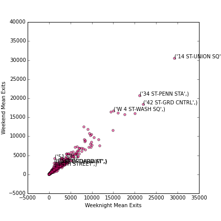
So, the hottest spots to hop off the train between 8 and 4am were…(drumroll)…
* 14th St - Union Sq
* 34th St - Penn Station
* 42nd St - Grand Central
* W 4th St
* 42nd St - Port Authority
I suppose that’s really not too surprising, since those are all busy stations in general. It also means that we’re not really getting the fluctuation to higher nightlife areas that we were hoping for. However, some stations with lower volume had a higher proportion of exits on weeknights versus weekends. These included:
* 51st Street
* East Broadway
* Thirty Third St
* 14th Street
* 14th St - Union Sq
These stations are much less well known, so it’s interesting that they rose to the tope. Perhaps some of these could possibly be locations with busier nightlife, so it would be exciting to compare with Uber/Taxi data or noise complaints to get a more complete picture of what’s happening there. And, to the hypothetical NYPD client, perhaps these are the locations to check out once in a while. Though since some of these locations don’t really have much traffic in general, well, maybe not.
We also made a cool scatter graph!

It’s a little hard to see the x=y line, so I might fiddle around with the graph a bit more later.
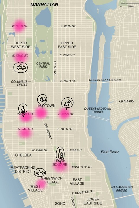
Additionally, we thought it’d be cool do do a quick sketch of a potential user interface for this project. Although we haven’t had a chance to look at any additional data sets, this map shows what we might be able to generate down the line. It includes an overlay of the turnstile hotspot data with some lovely icons, drawn by yours truly, indicating certain misdemeanors, sound violations, or areas where there is a predominance of taxi/Uber data relative to subway data.

